The Psychology of Interior Design: What The Experts Think


Humans react to their surroundings and changes in the environment through their senses, whether that’s through smell, touch, sight or hearing. When it comes to interior design, the senses can evoke certain emotions, too.
But why do we react to certain surfaces, sights, and sounds differently? And how do brands use this to deliver a specific message regarding the style they want to get across? This article will be taking you through the psychology of interior design, answering all of these questions and more.
Along with what the science has to say about interior design, we will also be offering our tips from a design perspective on how to use texture, pattern, lighting, colour and sounds when it comes to your space - be it an office, a living, a restaurant or a school.
Click on any of the banners below to jump to a section:


Before we dive into each aspect of interior design, let’s take a quick look at this classroom. Click on any of the icons to find out about what the sensory features are. Whilst you are there, have a think about the following:
-
What stands out to you?
-
How do the surfaces make you feel?
-
Can you imagine how sound would travel in here?
The Psychology of Texture

Let’s take the texture of the exposed brick walls in the classroom above as an example. The roughness and irregularities might have negative connotations; for example, this study found that smooth textures are perceived more positively, whilst abrasive surfaces were linked to harshness.
Another study also found that our perceptiveness and desire for tactile qualities of an object were higher if you are in a negative mood, which means that if you are feeling low, you are more likely to feel more positive when you touch something, as opposed to visually taking something in. On the other hand, those in a positive mood are more likely to be more receptive to visual stimuli.
Texture in Interior Design
Obviously, it is a lot more nuanced than this when it comes to texture in interior design. When incorporated into a space, mixing up textures can actually add dimension to a room, which is a great thing. Having smooth textures all over the place can make a space feel hollow and lifeless, and textures can be a great way to inject some life into it instead.
Although psychology seems to suggest that rough and uneven textures lean towards the more unpleasant side of the emotional spectrum, when it comes to interior design, mixing up your textures can create focal points that make specific parts of your space stand out.
For example, a breakout area or an activity room with artificial grass can add a playful element to an office, and can also create a distinction between work and relaxation.
David Ewart, Lead Interior Designer and Director of Pavillion Broadway has this to say about making use of texture in interior design:
“The textures and features of a space can greatly influence our personal psyche. In our experience as interior design consultants, we are coming across an increasing number of projects which are deploying greenwalls for a myriad of reasons.
“Living walls are natural air filters, which can create a less stuffy, more oxygenated and lower toxin environment in a workspace. They can also assist with the purification of VOCs, toxin compounds that are released from many different types of office products, solvents or burning fuels.
The very presence of plants in our home and office spaces has been shown to have many health benefits across multiple peer reviewed studies, including improved concentration, increased attention span and even lower blood pressure, according to the Journal of Psychology and Anthroplogy.”
Tip: Avoid having too many of the same types of textures in one room, as this can be overwhelming to the senses.
The Psychology of Pattern
So, what does psychology have to say about patterns when it comes to interior design?
Sally Augustin, an environmental design psychologist says that patterns are made up of a combination of shapes, lines colours and types. Patterns also play on our sense of sight, so thinking carefully about what the type of pattern you incorporate in a space can be a make or break situation.
The science and psychology behind design, according to Augustin, suggests that we perceive places with more curved lines as being more comfortable, whereas we perceive those with straight lines as being more on the efficient side.
Pattern in Interior Design
Right angle lines and straight accents can certainly add a sense of firmness and efficiency to a room, however, too much of this can risk building tension and stress if they come across as too harsh. As with the suggestion of mixing textures, consider where it may be appropriate to incorporate lines of different curvatures.
Of course, only mix things up where appropriate, as overdoing it and making the space look too busy with patterns can create a sense of clutter than could potentially even put people off from entering your retail store, for example.
The Psychology of Lighting
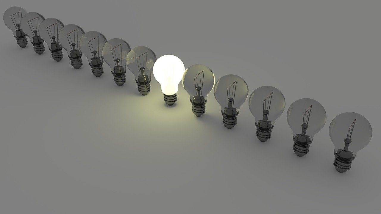
Augustin also discusses that different levels of brightness in a space can lead to both positive and negative outcomes. For example, different levels of brightness, hues and even the colour of light can evoke certain emotions.
A study that looked into the relationship between indoor environments and job satisfaction have found that ensuring that there are adequate levels of natural light coming through at an office desk, for example, can lead to higher job satisfaction and wellbeing.
Research from another study in the Journal of Consumer Psychology found that lighting that used warmer hues cultivated warmth, whilst hues of blue brought on feelings of angst. We will cover more on colours in the section following this.
The research surrounding the benefits of natural light points towards it being positive - during the day, allowing natural light into your spaces can help to regulate our circadian rhythms that keep us awake and alert throughout the working day.
Jamie Moxey, Design Consultant at Dusk Lighting explains that there are three key ways in which lighting is a subtle but effective way to create a certain atmosphere, as well as influencing the mood of those occupying a particular space:
Warm lighting makes us relaxed: “Warm colours on the Kelvin scale are between approx. 2700K - 3000K and are recognisable as red/yellow tones. The soft nature of the lighting replicates the natural lighting of dawn and dusk, which encourages relaxation and, additionally, it supports the secretion of melatonin which leads to better sleep. Warm lighting proves most effective in bedrooms and living rooms and, in a commercial setting, would be most beneficial for restaurants or spas.”
Cold lighting makes us alert: “On the other end, cold colours are approx. 5000K - 7000K. Exposure to this lighting makes us feel more awake and has been proven to increase productivity in workplace settings. Blue light has also been strongly linked to trouble sleeping because it is believed to prevent the brain’s production of the aforementioned melatonin. Blue lighting is best suited to areas that require focus, such as a home office or workspace.”
Bright light intensifies our emotions: “Bright lights heighten emotions – however, this can be either positive or negative. For example, a study from the Journal of Consumer Psychology revealed that, when exposed to bright light, participants claimed they felt warmer when asked, despite the temperature remaining the same. Therefore, dimmer lighting should be utilised in environments that require rational thinking."
Lighting in Interior Design
In the classroom example above, you can see that there is window access which allows plenty of natural light to enter the classroom. As discussed above, being exposed to natural light gradually throughout the day helps keep our circadian system in check, so we are more likely to be alert - this is exactly what you would want from the functionality in a classroom.
Tip: Don’t have a lot of windows in your space? Why not try daylighting? This is a practice that makes use of lighting features that mimic natural daylight. Having light features that mimic natural light that we see outside, which gradually adjust to the time of day can also be an adequate substitute when natural light is difficult to include.
In the retail scene, natural lighting can make all the difference in sales. A study that looked into the impact of this on retail sales performance found that the use of skylights that mimic natural light contributed to increasing the number of sales.
The Psychology of Colours
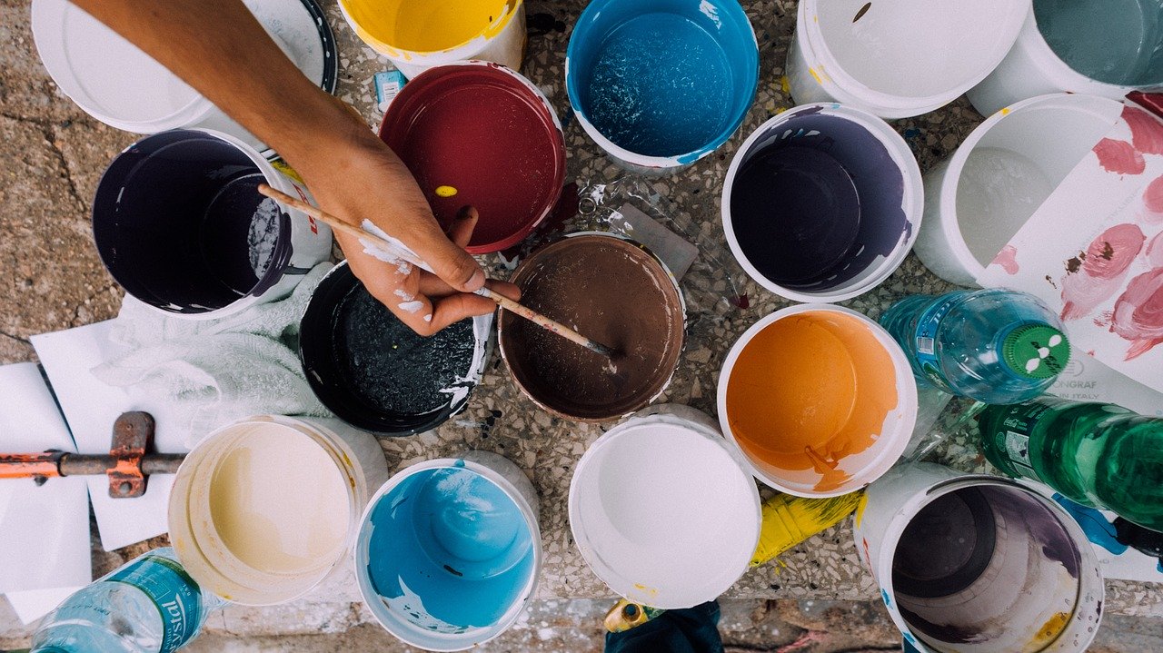
Arguably, colour can be a huge determinant of how humans react to their surroundings. Colour psychology has been used in a manner of fields, from marketing to interior design, and it is easy to understand why.
Whilst the science behind colours and how they make us feel is still in the early stages of research, in marketing, colour psychology is all about context. For example, blue is used in more corporate marketing collateral, and red is used as a call to action. Green may be used to convey messages about the environment or nature, but can also be used in branding for money.
Colours in Interior Design
In the same way that the context of colours used in marketing matters, the same thing resonates with the context of the colours you decide when it comes to your interiors.
Marie Parry, Design Manager at Prestigious Textiles says:
“With today’s society being so busy and hectic it is a big trend to make your home a sanctuary of calm away from the chaos of the outside world. This style is enhanced by soothing, tranquil colours such as Pantone classic blue, a hue proven to be a serene, relaxing shade. This colour trend brings the outdoors inside and combines very well with foliage and plants further embracing the peaceful, laid back style.”
The Psychology of Acoustics
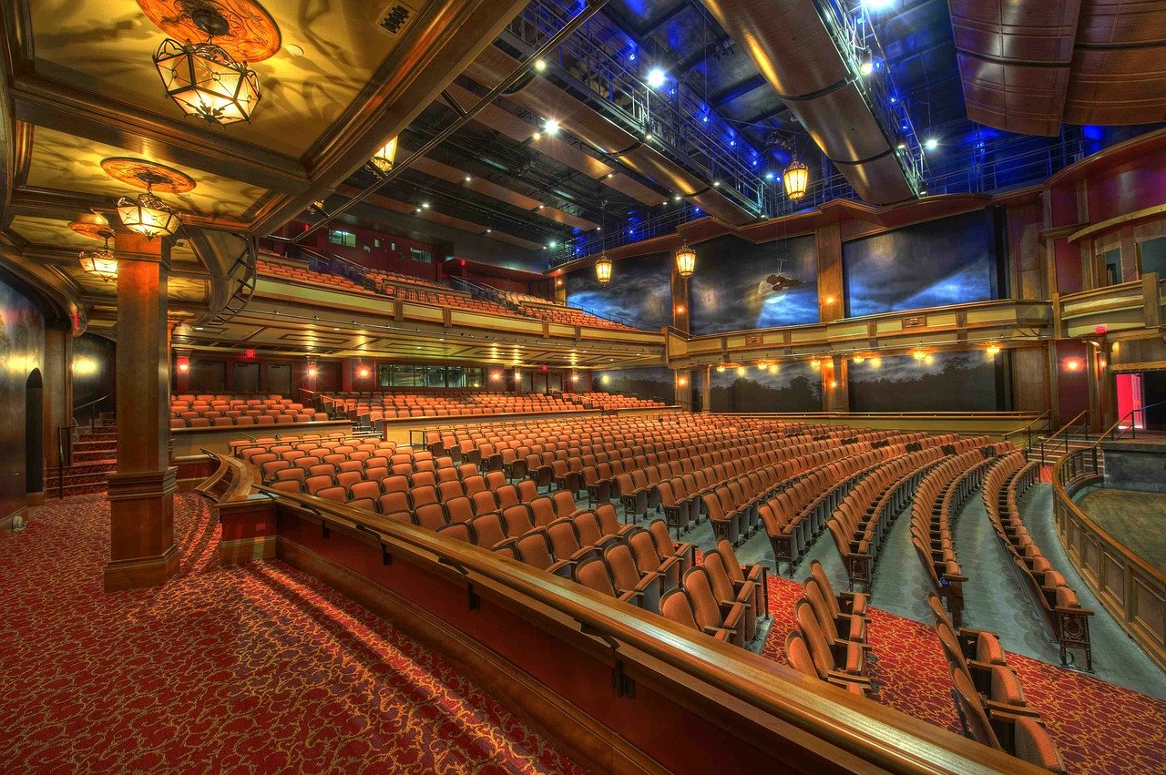
Last but not the least, let’s not forget about sound. Acoustics matter, whether you are at home, at the office or shopping in-store. Having the right acoustics in place matters, for example, its vital for communication.
For health and wellbeing, sound matters. In offices, noisy environments can cause low productivity and an increase in employee absences, according to a study by British Journal of Psychology, which is an ever-increasing issue in modern offices in open plan offices.
Another study also found that in education, high levels of exposure to noise can affect children’s cognitive development in their early years.
By the sounds of it, acoustics seem like a pretty big deal!
Acoustics in Interior Design
What kind of things should you be considering when it comes to how sound travels in your spaces?
-
In the office, consider creating quiet areas, or breakout spaces for when you need to focus for the former and have team discussions in the latter.
-
Upholstered furniture, acoustic panels and even carpets can absorb sound, so use this strategically if you want to minimise echoes.
-
Again, ensure the acoustics of the room match the context that it is going to be used in. You want the sound to be projected in places like an auditorium or a lecture theatre, but you might want the acoustics of a reception room to allow for clear communication between the receptionist and visitors.
Final Thoughts
At the end of the day, when it comes to deciding on the texture, pattern, light, colours and acoustics of a space, it all boils down to its intended use. Different spaces may demand differing design considerations, so there is no one size fits all approach to interior design.
In a nutshell, it helps if you know your audience, know the context and consider what the science has to say about each aspect of interior design - with these points in mind, you will be onto a winning space.